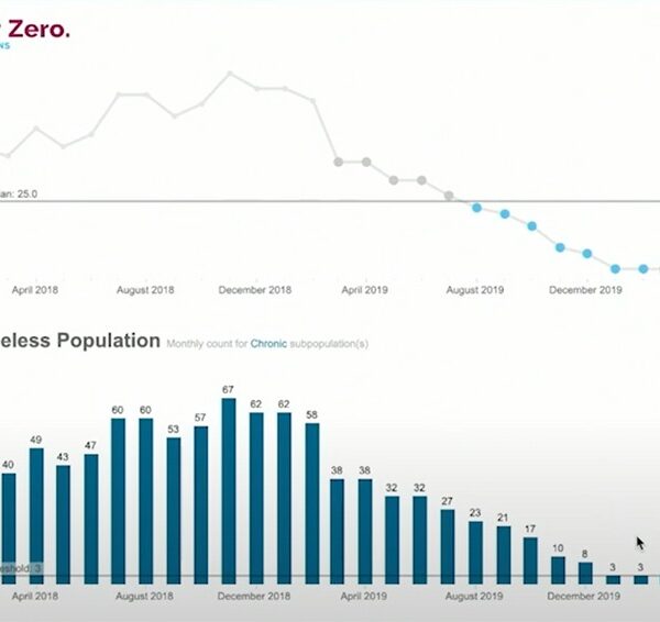
Collecting real-time, by-name data on every person experiencing homelessness in a community is at the heart of Built for Zero’s methodology.
Data visualization can help communities make sense of this information.
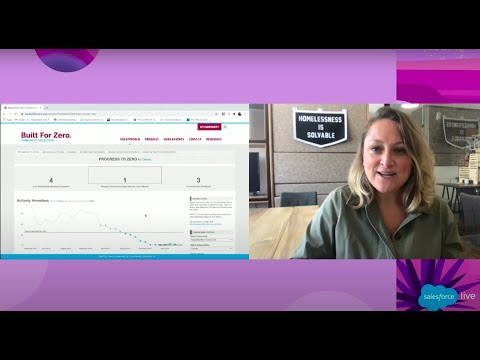
Watch Built for Zero Co-Director Beth Sandor explain how communities like Bakersfield and Kern County, California are using Tableau dashboards to visualize their data in order to help them reduce and end homelessness:
By using these Tableau dashboards, communities can track progress month-over-month, using a run chart. A run chart is an essential measurement from the field of Improvement Science. It is an excellent tool for tracking a phenomenon like homelessness across a whole community over time. A good run chart can help leaders spot patterns in the data, assess the effectiveness of changes they implement, refine improvement strategies over time, and distinguish between change and normal variation in a system.


